1000 Year Temperature Comparison cs
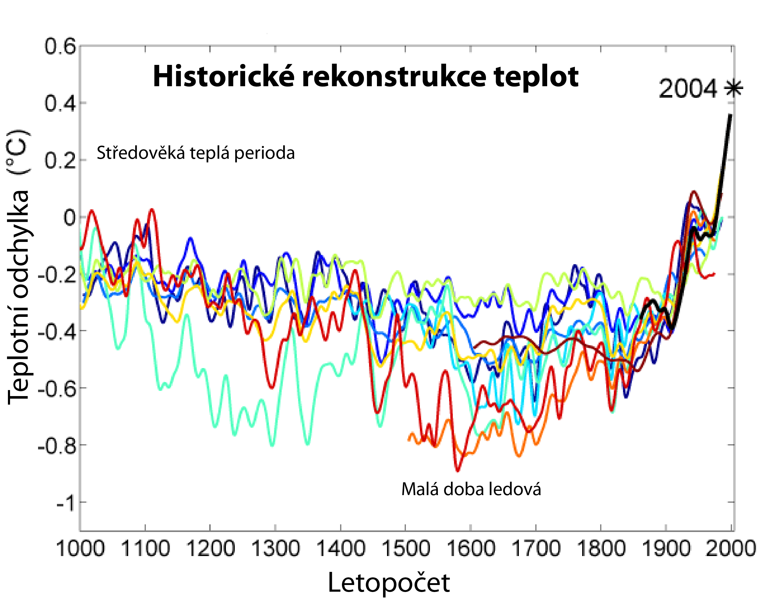

Přisuzování:
Obrázek je označen jako „Vyžadováno uvedení zdroje“ (Attribution Required), ale nebyly uvedeny žádné informace o přiřazení. Při použití šablony MediaWiki pro licence CC-BY byl pravděpodobně parametr atribuce vynechán. Autoři zde mohou najít příklad pro správné použití šablon.
Formát:
2496 x 1966 Pixel (183147 Bytes)
Popis:
This image is a comparison of 10 different published reconstructions of mean temperature changes during the 2nd millennium. More recent reconstructions are plotted towards the front and in redder colors, older reconstructions appear towards the back and in bluer colors. An instrumental history of temperature is also shown in black. The medieval warm period and little ice age are labeled at roughly the times when they are historically believed to occur, though it is still disputed whether these were truly global or only regional events. The single, unsmoothed annual value for 2004 is also shown for comparison. (Image:Instrumental Temperature Record.png shows how 2004 relates to other recent years). It is unknown which, if any, of these reconstructions is an accurate representation of climate history; however, these curves are a fair representation of the range of results appearing in the published scientific literature. Hence, it is likely that such reconstructions, accurate or not, will play a significant role in the ongoing discussions of global climate change and global warming. For each reconstruction, the raw data has been decadally smoothed with a σ = 5 yr Gaussian weighted moving average. Also, each reconstruction was adjusted so that its mean matched the mean of the instrumental record during the period of overlap. The variance (i.e. the scale of fluctuations) was not adjusted (except in one case noted below). It should also be noted that many reconstructions of past climate report substantial error bars, which are not represented on this figure. This information is accurate, however if you are looking for a time before 1000 A.D. it does not depict a length of time before 1000 years when the earth used to be all tropical. It fails to convey the whole story.

Color Guide

The reconstructions used, in order from oldest to most recent publication are:

  1. (dark blue 1000-1991):
  2. (blue 1000-1980):
  3. (light blue 1000-1965):
  4. (lightest blue 1402-1960):
  5. (light green 831-1992):
  6. (yellow 200-1980):
  7. (orange 200-1995):
  8. (red-orange 1500-1980):
  9. (red 1-1979):
  10. (dark red 1600-1990):
  11. (black 1856-2004):

Notes

Instrumental data was jointly compiled by the Climatic Research Unit and the UK Meteorological Office Hadley Centre. Global Annual Average data set TaveGL2v [1] was used. Documentation for the most recent update of the CRU/Hadley instrumental data set appears in: The original version of this figure was prepared by Robert A. Rohde from publicly available data and is incorporated into the Global Warming Art project. #Data from Moberg et al. was taken directly from the supplemental information accompanying the Nature article. #Data for Oerlemans was provided by William M. Connolley. #Esper et al. reported only fluctuations in "arbitrary" units, so the variance in this record was rescaled to match the variance during the period of overlap with the instrumental record. #When a paper included multiple reconstructions, the global annually average temperature data was used. If this was not reported, then Northern Hemisphere annually averaged data was used. #Four records appearing at [2] were not used in preparing this graph for the following reasons: ##Mann et al. 98 was not included because Mann et al. 99 extended and updated that record. ##Briffa et al. 98 was not included because Briffa et al. 2001 extended and updated that record. ##Pollack et al. 98 was not included because the reported data was not found to be in a form that allowed for easy replotting. ##Mann et al. 2000 was not used because it did not include an original reconstruction covering at least the Northern Hemisphere.
Licence:
Sdílet obrázek:
Facebook   Twitter   Pinterest   WhatsApp   Telegram   E-Mail
Více informací o licenci na obrázek naleznete zde. Poslední aktualizace: Tue, 05 Dec 2023 20:10:57 GMT

Relevantní obrázky

(c)
Image source: Canty, T., Mascioli, N. R., Smarte, M. D., and Salawitch, R. J.: An empirical model of global climate – Part 1: A critical evaluation of volcanic cooling, Atmos. Chem. Phys., 13, 3997–4031, https://doi.org/10.5194/acp-13-3997-2013, 2013.
Original plot: US National Climate Assessment 4.
Merging of factors into composite lower panel and common °F scale: User:RCraig09.
Translation and °C scale: User:DeWikiMan, CC BY-SA 4.0

Relevantní články

Hokejkový graf

Hokejkový graf je přezdívka, kterou dostal graf rekonstrukce průběhu teplot z proxy dat za posledních 500 až 2000 let. Tyto rekonstrukce ukázaly relativně lineární průběh teplot od středověku až do roku 1900 a poté náhlý vzestup, kde instrumentální záznamy teplot v roce 2000 překročily všechny předchozí rekonstrukce teplot za toto období. Termín hokejka použil poprvé Jerry Mahlman, když popisoval graf z práce Mann, Bredley a Hughes 1999 s tím, že relativně lineární část grafu od středověku do roku 1900 připomíná hůl hokejky, zatímco náhlý nárůst v posledních letech připomíná její čepel. Tato rekonstrukce byla použita ve zprávách IPCC jako důkaz současného globálního oteplování. Různé skupiny lidí začaly tento graf zpochybňovat a tím zpochybňovat celé výzkumy globálního oteplování. .. pokračovat ve čtení

Atribuce probíhající klimatické změny

Atribuce probíhající klimatické změny, nebo připisování probíhající klimatické změny jednotlivým příčinám je úsilí vědecky zjistit mechanismy odpovědné za probíhající globální oteplování a související změny klimatu na Zemi. Úsilí se zaměřilo na změny pozorované během období instrumentálních teplotních záznamů, zejména za posledních 50 let. To je období, kdy se lidská činnost nejvíce zintenzivněla a zároveň jsou k dispozici detailní pozorování troposféry. Podle Mezivládního panelu pro změnu klimatu (IPCC) je „extrémně pravděpodobné“, že lidský vliv byl v letech 1951 až 2010 dominantní příčinou globálního oteplování, podle některých zdrojů bylo pozorované oteplování od roku 1951 způsobeno výhradně lidmi. .. pokračovat ve čtení