Optical Size Demonstration
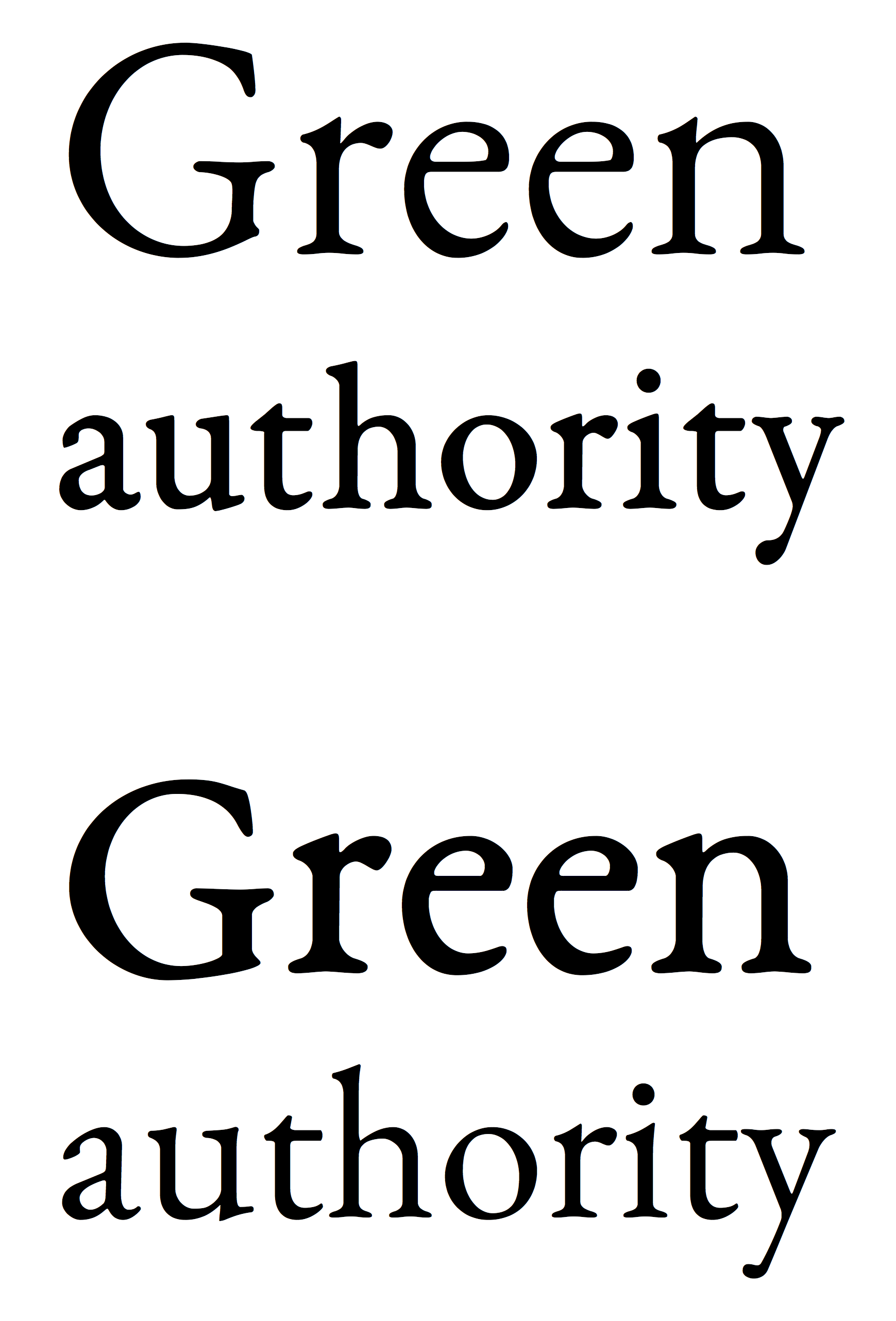
At top is how this is meant to look, using the open-source font EB Garamond: the larger text is in a slimmer size 12 weight, while the smaller text is in a size 08 weight that is bulkier so it looks clear when printed small. At bottom is the wrong way round: size 08 blown up looks heavy and size 12 printed small looks anaemic.
It is worth noting that this is quite a subtle example and other fonts have much bigger changes across optical sizes. For example, the caption style of PT Serif massively increases the x-height (the height of small lower-case letters).
This image was suggested by an illustration in the article "How To Choose The Right Face For A Beautiful Body" by Dan Reynolds.


Relevantní obrázky


Relevantní články
FontPojem font se využívá především v typografii, kde je definován jako kompletní sada znaků abecedy jedné velikosti a jednotného stylu. Slovo font se dnes pojí především s použitím jednotlivých stylů písma ve výpočetní technice. .. pokračovat ve čtení